


I grew up as an architect loving modernism and its clean lines, its spartan rectilinear shapes and its honesty of materials. But now that I’ve gotten some distance from my modernism-centric education, I see how modernism can go wrong, especially on a residential scale in established neighborhoods.
As I’ve written emphatically before, I don’t think the solution is to copy historic homes, but to create a new contemporary architecture that reflects the materials, sensibilities and values of today while still honoring timeless and universal principles of being neighborhood and people oriented. Historic homes celebrated the front porch, for example, fostering a social connection between a household and it’s neighbors. Plus they were welcoming and you knew right away where the front entrance is.
Many modernist contemporary homes are very inwardly focused, with no porches and a hidden front entrance, which make for an unwelcoming, fortress-like feeling and so they do not make good neighbors. But this is not to say that modernism on a residential scale can’t be done well. Northwest modernist Pietro Belluschi’s homes are a great example of a residential architecture that not only fits into the neighborhood, but enhances it. Southwest architect Ralph Haver had the same knack.
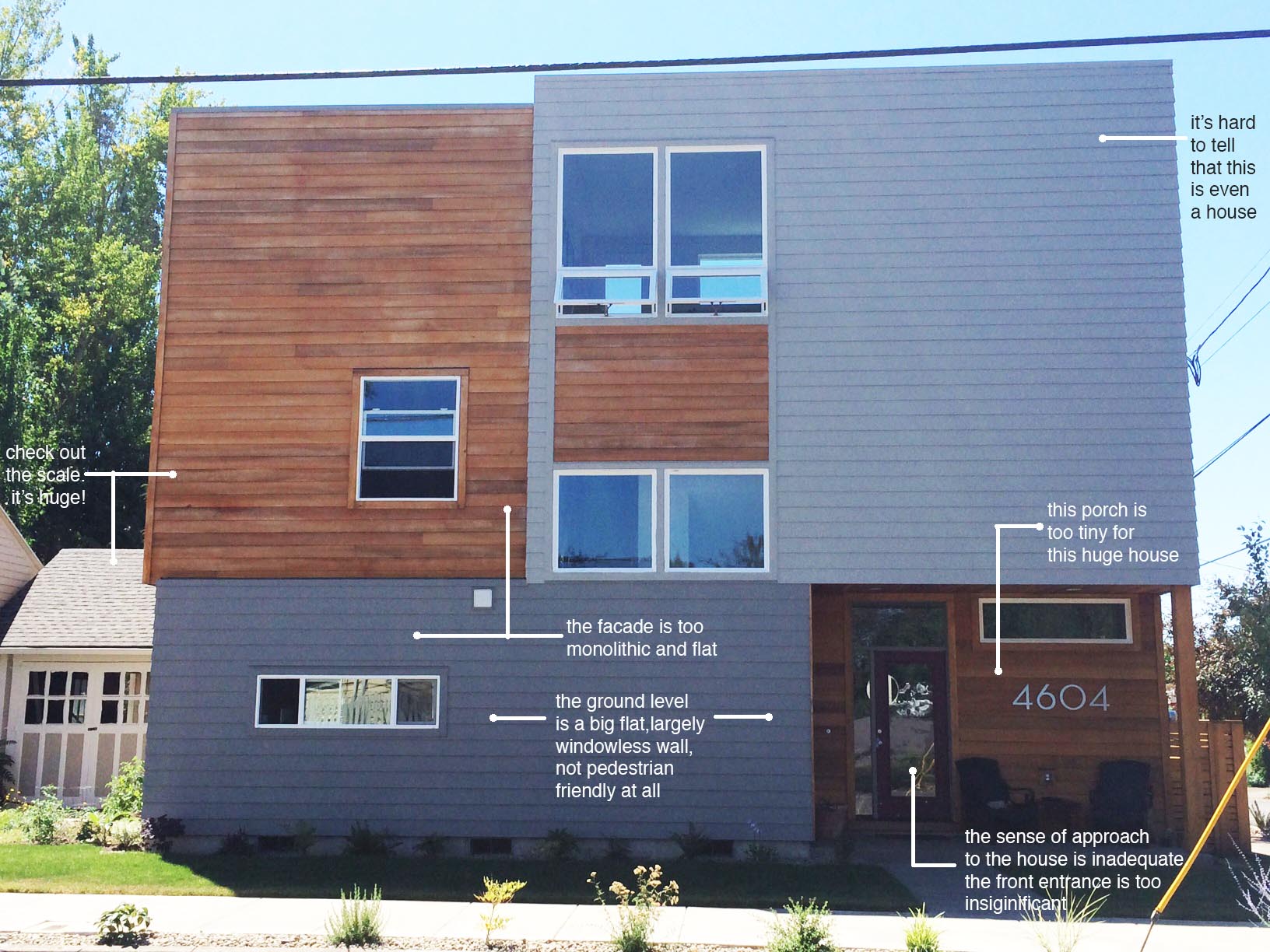
Below is an particularly stark example of contemporary modernism gone wrong in an established historic neighborhood in contrast with a historic home that has been updated, but which retains the principles of neighborhood-friendliness and human scale.
Modern House:
Historic House:
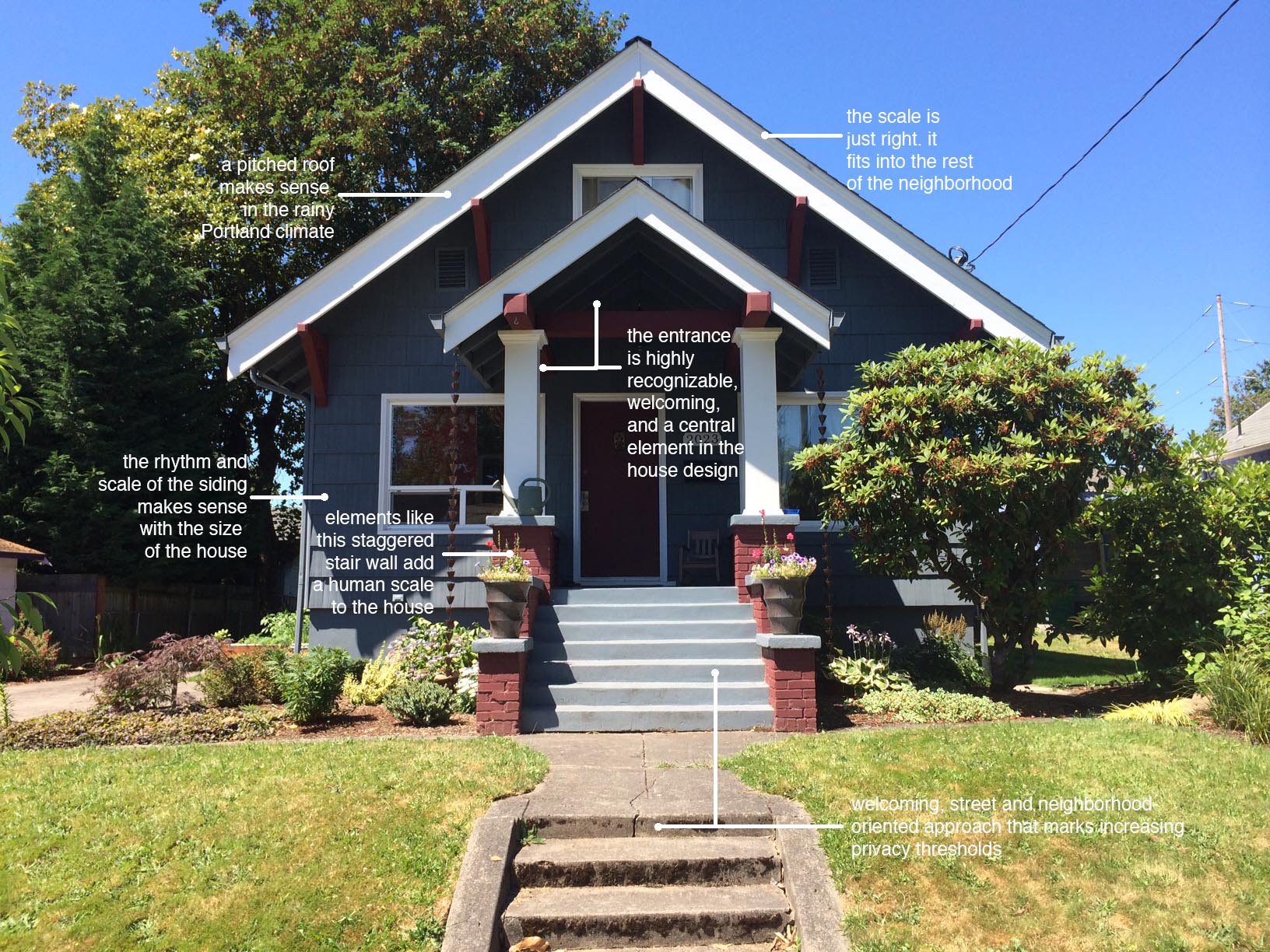
Photo Credit: All photos by the author.


I never really thought about it, but this is all so true. And I ride by that house and one exactly like it in Arbor Lodge all the time. I find myself wondering who lives there and what kind of pup lives in the dog bed I can see in the window.
Wow, you’re right about the scale…. it seems reasonable and well-proportioned (for a 2-D composition) until you look at that front door. The other thing I notice is the difference in landscaping and how the house relates to its lot. If we’re facing south in that top photo, that front strip is pretty um unimpressive as it is, but might also be in permanent shade.
Taz I wonder if you could find the designer of that top house and put some of these issues in front of him or her…….?
Nice little post. I shared this on Facebook, and have had some comments as well. I have pedaled by this thing so many times, and am still scratching my head about how this happened (I think there’s another one in the works on SE 34th). The architecture of this thing is wrong on so many levels (does not match the community homes, no porch area, and even materials used seemed misplaced. Thanks for this post.
Honestly, that house looks like it wasn’t designed by an architect so much as by one of the “Design / Build” firms that pump out houses that meet either a client’s vague ideas or just check some boxes (often using a “designer” who doesn’t have any education in the bigger ideas of process and environment). It amoundts to space planning with minor architectural details attached rather than around ideas and the proper concepts you talk about in your post. This house definitely look like someone did some general space planning and then stuck on whatever modern-ish things they could come up with to decorate it without them serving any actual purpose.